Selling cars on the internet is increasingly critical. Autocar Business puts manufacturers’ websites to the test
The relationship a car maker has with its customers has never been more crucial than now, and that relationship is often made or broken on the strength of its digital presence.
Physical retail remains a fundamental pillar of many brands’ business models, irrespective of their position on the merits of ‘click and collect’ agency sales, but a website is often the first point of interaction between company and customer – so it has to be a good one.
But which brands are best represented online? Autocar Business has tested the customer-facing websites of each of the UK’s leading car brands to find out how well they sell the brand and how easy they make the car-buying experience.
We’ve ranked each website from one to five in five key categories – causal browser, configurator, new car buyer, used car buyer and finance – to evaluate its overall experience and determine how much of an asset it is to the car company.
Read on to find out how each performed:
Abarth
3/5
Date tested: 19.12.22
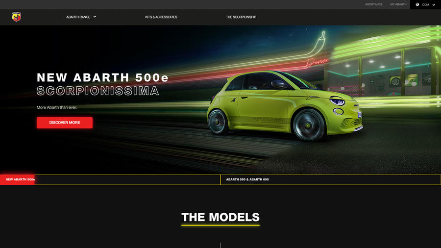
Bright and informative – Abarth’s website works hard to engage and inspire browsers and buyers alike. It’s a lot of fun and pitches the brand well.
Casual browser 4/5
Zingy colours, cute cars, lots of bright red signpost tabs and a prominent top menu – and that’s just the homepage. There’s lots here to engage the passing visitor. Even the history section is a good read.
Configurator 3/5
Easy to find and fun to use and while there’s no rotation tool and only five images, the renditions are clear and lifelike. Much kit is standard so changes are mostly limited to wheels, paint and seats.
New car buyer 4/5
Enticing imagery, a clear hierarchy and good signposting quickly grab and funnel the visitor to the ‘discover more’ model explainers, configurator and finance calculator. All link up neatly so there’s little risk of getting lost.
Used car buyer 2/5
Unfortunately, the greyed-out ‘used Abarth’ drop-down at the top of the homepage is easy to miss. Once found, you’re taken to the Spoticar website, a dreary and functional affair that’s stylistically unrelated to Abarth.
Finance 1/5
Used car buyers get a loans calculator and part-exchange estimator, but new ones must complete a contact form and await a dealer call. It’s the only black spot in an otherwise helpful site.
Alfa Romeo
3/5
Date tested: 28.12.22
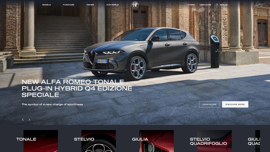
For a brand as emotional as Alfa, its website is surprisingly restrained but none the worse for that in terms of its clarity and ease of use.
Casual browser 3/5
The homepage presents the range, each model supported by invitations to configure or discover more. Scroll down for more content or use the top menu shortcuts. It’s clear and straightforward but lacks passion.
Configurator 3/5
Well signposted and structured with visualisations that clearly reflect updates. There are just six images to explore but at least the rotation tool allows the viewer to see the exterior in 360deg.
New car buyer 4/5
The prominent range display on the homepage is helpful. Via ‘discover more’ buttons visitors can explore and compare models in detail, configure their chosen version, personalise their finance and arrange a test drive.
Used car buyer 2/5
Find it from the top menu or scroll down to Alfa Romeo Certified on the homepage. The area works hard and is on-brand but the quality of dealers’ used car images is inconsistent, with some downright awful.
Finance 3/5
The finance calculator’s sliding scales allow the user to easily personalise a PCP or PCH. However, its usefulness is limited by the absence of a part-exchange valuation tool. On the plus side, there’s an eligibility checker.
Alpine
2.5/5
Date tested: 28.12.22
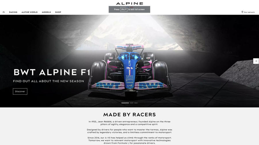
Alpine’s website is clean, clear and direct but lacks sparkle. It’s strong on the model range, but it’s not possible to calculate finance or find used cars.
Casual browser 3/5
On the homepage, flashing imagery promoting the A110 R does a fine job of seizing the passing viewer’s attention. The site is clean, clear and efficient, helped by features such as ‘Take the next step’.
Configurator 4/5
Much to enjoy here including the ability to change backgrounds, open and close the doors and a rotation tool for the interior as well as the exterior. The digital imagery is soft but convincing enough.
New car buyer 3/5
The prominent model selector on the homepage quickly takes the visitor to a detailed features page and configure tab. A helpful ‘Take the next step’ drop-down menu offers further destinations but it’s not possible to explore finance.
Used car buyer 0/5
There’s nothing for the used car buyer here but at time of writing only eleven dealer cars were advertised nationally, so until the stock situation improves, it’s understandable.
Finance 0/5
If they want to discuss financing their Alpine, customers have to talk to a dealer; there’s no finance calculator. Instead, the finance button, tucked away at the foot of the homepage, links only to the dealer locator.
Aston Martin
4/5
Date tested: 28.12.22
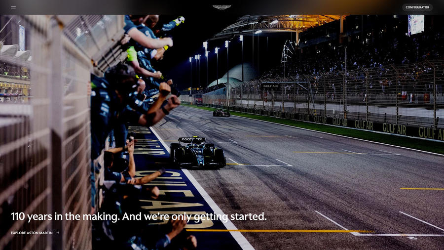
A brand as emotional and evocative as Aston Martin deserves a website to match and that’s what it gets but it can be overwhelming.
Casual browser 3/5
The homepage promotes key models and bold imagery sets the tone but until you locate the discreet menu (it’s top left), the full website is a mystery.
Configurator 4/5
Change the environment and time of day, open and close the roof blind and doors – and that’s before you start personalising your car to the last detail. Aston’s configurator is impressively versatile although images are soft.
New car buyer 5/5
On the homepage, swiping over the DBX 707 reveals the rest of the range supported by prominent ‘Explore’ and ‘Configure’ tabs. From the latter, save and submit your configured Aston to a dealer.
Used car buyer 5/5
Find the pre-owned Aston Martin area via the homepage or in the menu. The section is perfectly in tune appearance-wise with the rest of the site and the dealer photography of a high standard.
Finance 0/5
It’s not immediately obvious (we found it below the pre-owned section), and once there, a message told us the page could not be found.
Audi
4/5
Date tested: 30.12.22
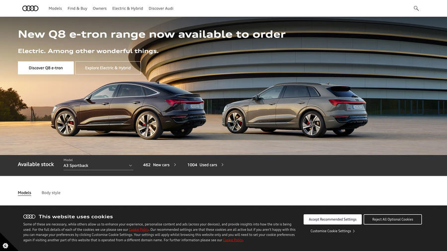
As you might expect, this site is efficient, comprehensive and well organised, but the tone is also surprisingly warm and welcoming and there are regular calls to action.
Casual browser 5/5
Bold labelling, few distractions and a clear hierarchy characterise the homepage which, despite its spare appearance, packs a lot of content including links to new and used cars, finance, the configurator and offers.
Configurator 3.5/5
Not the most versatile configurator (there’s no rotation tool and the backgrounds can’t be changed from white), but the visuals are among the clearest and most realistic. Options include exclusive paint finishes.
New car buyer 5/5
A simple range gallery topped by a featured vehicle is a good start. A nice touch is the in-stock availability counter above. Click on a car and a trim for the configurator, explainer and finance and part-ex calculator. Simple.
Used car buyer 5/5
Opportunities to browse and buy used Audis abound. In fact, few sites present their used cars so well. Browse by category, explore offers and filter and search more than 10,000 used Audis presented in branded environments.
Finance 5/5
From giving finance its own place on the homepage to providing helpful explainers and a Q&A, Audi does finance well. Hit the calculator tab to choose a model, explore costs and get a part-ex estimate.
Bentley

4/5
Date tested: 3.1.23
This website presents no obstacles either to the browser or the initiated, save for the absence of prices. But then if they have to ask, they can’t afford it…
Casual browser 5/5
A tidy, two-deck homepage with top menu presents all the content in one quick scroll. The language is welcoming and signposting clear, and it’s easy to retrace steps. Pre-owned is prominent and there’s a good history section.
Configurator 5/5
No clever tricks, instead just clear, detailed imagery with all options accurately rendered. It’s possible to view the panoramic sunroof from above as well as take in the whole interior in one sweep – both big pluses.
New car buyer 5/5
‘Models’ in the top menu is the simplest entry point. Using the sub-menu refines the choice of vehicle and then it’s off to the configurator to play. In the summary is an ‘Enquire to buy’ button to learn more.
Used car buyer 5/5
Thanks to its prominent position on the short homepage, ‘Pre-owned’ is easy to spot. It’s well integrated stylistically, too, and the filtering functions, supported by an illustrated model selection menu, work well. Dealer ads are on-brand.
Finance 0/5
The nature of finance at this level means there’s no new car finance calculator. Instead, visitors are directed to a dealer to discuss numbers. Ditto used cars, although some listings feature hire purchase calculators.
BMW
4/5
Date tested: 30.12.22
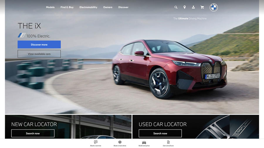
Clear, direct and to the point, that’s the BMW website. It’s a functional sales tool packed with information and tabs but few would call it warm and welcoming.
Casual browser 3/5
A homepage that places the range gallery below the featured model and new and used car locators suggests this site is for the shopper rather than the browser. Fortunately, there’s good signposting and lots to discover.
Configurator 4/5
Easy to locate and features include background and time of day options plus, that rare thing, a rotation tool that enables the whole interior to be scanned. Visuals look too computer generated but are impressively detailed.
New car buyer 5/5
Prominent ‘Find and buy’, ‘Build and price’ and’ New car locator’ tabs mean few visitors leave empty handed. Click to be taken seamlessly to detailed model explainers, the configurator, finance and a live chat facility.
Used car buyer 5/5
The used car locator on the homepage is the portal to a world of approved used BMWs, searchable by everything from model to postcode, all presented in a branded environment and with a finance calculator.
Finance 3/5
‘Find & Buy’ on the homepage takes the visitor to explanations of each of the common products. However, while you can search for general finance offers, for a personalised quote you must contact a dealer.
Citroën
3/5
Date tested: 3.1.23
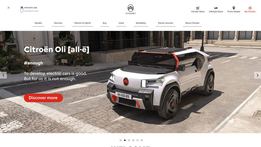
Bright and breezy, the Citroën website aims to help all visitors from browser to buyer but can be too clever, and it’s easy to get tied in knots.
Casual browser 4/5
A warm, welcome opening with the question, ‘What would you like to do?’ characterises this website. It’s packed with helpful entry points and bright red buttons. Impressively, for deaf and hard-of-hearing visitors, there’s ‘Sign Live’.
Configurator 2.5/5
Well linked and signposted. Images are detailed and interiors have a 360deg viewing tool. It connects well with finance but option choice is poor, imagery is plain and it would benefit from contextualised backgrounds.
New car buyer 4/5
No one need go away empty-handed from this website. Links to the online store abound while in the top menu is a section simply called ‘Buy’. Next steps include an invitation to speak to the online sales team.
Used car buyer 4/5
This area of the website is well signposted. Links take the user to Spoticar, which has a good search filter and finance and part-ex calculators. Listings look professional albeit lacking some of the main website’s sparkle.
Finance 3/5
Most journeys lead to a finance calculator offering hire purchase or PCP. However, there are no cautionary notes accompanying it, not even in the finance section itself. In these inflationary times, that’s some omission.
Cupra
3/5
Date tested: 3.1.23
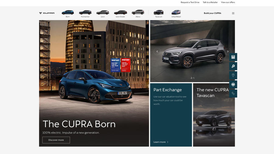
This new brand on the block works hard to impress but risks confusing visitors with a fragmented homepage. However, stay with it and it’s all there.
Casual browser 3/5
The homepage lacks a clear focus and hierarchy. There are no fewer than three range galleries, but it’s not immediately clear what category each model represents. However, there’s good signposting and a prominent part-ex valuation tool.
Configurator 3/5
Because Cupras are well equipped as standard, there’s little to play with apart from colours and wheels. The rotation tool works in interior as well as exterior modes, though, which is very helpful.
New car buyer 5/5
From the range galleries, it’s a short step to discovering a new Cupra. Still unsure? Visit the virtual showroom. Prominent ‘Test drive’ and ‘Build yours’ tabs get the user started and there’s lots of help for EV newbies.
Used car buyer 0/5
There’s no used cars area.
Finance 3/5
The finance section includes finance and part-ex calculators and helpful advice for those baffled by the topic. However, it’s not possible to enter the configurator price into the calculator, which just works off the list price.
Dacia
3.5/5
Date tested: 4.1.23
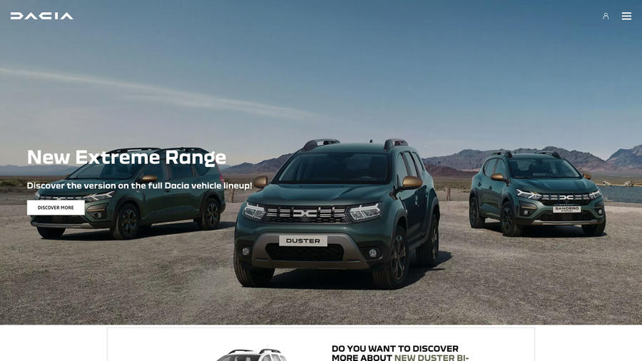
Just like the cars, Dacia’s website cuts through the new car glitz to bring new car buyers what they need in an intelligent and intriguing package.
Casual browser 5/5
On the homepage, Dacias in butch khaki and the question ‘How can we help you?’ prompt interest while the model comparison tool gets the visitor stuck into the range. Clear signposts and labelling do the rest.
Configurator 2/5
Easily found and rewarding to use with 360deg rotation of exterior and interior, although the computer-generated imagery could be sharper. In the summary, calculate finance, value a part-ex and find stocks of a chosen model.
New car buyer 5/5
If visitors don’t buy a new Dacia after their tour, they weren’t in the market. Step-off points into the range abound and most journeys lead to the configurator and its feature-packed summary.
Used car buyer 0/5
There’s no used car area. Instead there’s a dealer locator, but it doesn’t list website addresses or links, meaning visitors can’t click and view used car stocks. It’s a missed opportunity.
Finance 2/5
There’s a finance explainer, voiced by Ralph Ineson, aka Finchy from TV show The Office. The association aside, it ducks the risks associated with borrowing. Greater honesty from this otherwise plain-speaking brand would be welcome.
DS
3/5
Date tested: 3.1.23
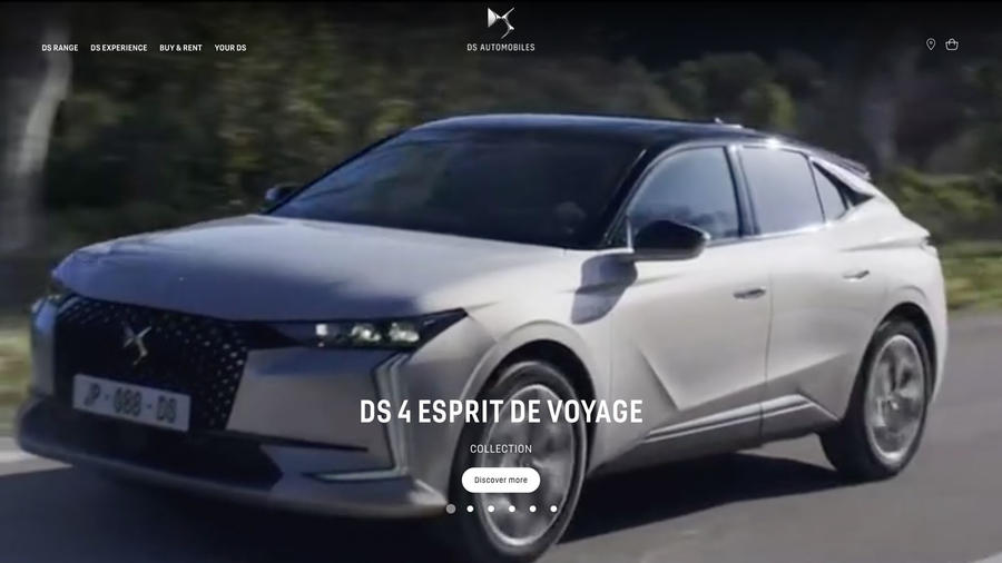
A blend of hard and soft sell, this website talks up the brand while chasing the money with offers and an online shop. It’s a contradictory picture.
Casual browser 3/5
The stylish film on the homepage sets a premium tone, as do the brand stories further down. The range gallery is impossible to miss and buttons link to model pages. It’s easy to lose your way, though.
Configurator 2/5
This reskinned version of Citroën’s car-builder but without its 360deg interior visualisation tool is a disappointment. Exterior images lack punch, interiors look artificial and there are few personalisation opportunities for such an aspirational brand.
New car buyer 4/5
Aspirational it may be, but DS wastes no time getting visitors stuck into the business of buying a car from its online store. There are good offers, too. Need help? The DS concierge team awaits your call.
Used car buyer 4/5
Used DSs are marketed by Spoticar, but the section isn’t obvious which is a pity since, to its credit, it embodies the tone set by the website and works well.
Finance 3/5
New and used car finance calculators, budget-setting sliders, new car offers: it’s all here. What’s missing are advice pages explaining the best finance options for customers. Fortunately, the concierge team is a phone call away.
Ferrari

4.5/5
Date tested: 4.1.23
For a website with so much to communicate, this is well organised and welcoming. However, it takes time to master the many tools and features.
Casual browser 5/5
The website opens with a story about three childhood fans. For the cars, click on ‘Auto’ in the top menu and take your pick. Explore model videos, specifications and much more. Engaging and well organised.
Configurator 5/5
Animations (open and close doors), zoom and rotate, variable backgrounds, 3D, 2D and high-definition visuals and, of course, the ability to personalise a Ferrari to the nth degree: it’s all possible but takes practice.
New car buyer 5/5
Select a car from the model list to enter a world of animations, 360deg visuals and even engine noises. Next steps include configure and enquire buttons. Informative and entertaining but it can be overwhelming, too.
Used car buyer 5/5
Located prominently on the homepage, visitors search by model alone and then, on the listings page, filter by age and mileage. In terms of design and image quality, it’s a destination in tune with the main website.
Finance 2/5
Visitors will look in vain for a finance calculator. Instead, there’s a link to the company’s Premium Ownership Programme of bespoke financial services for new, used, classic and race cars.
Fiat
3/5
Date tested: 4.1.23
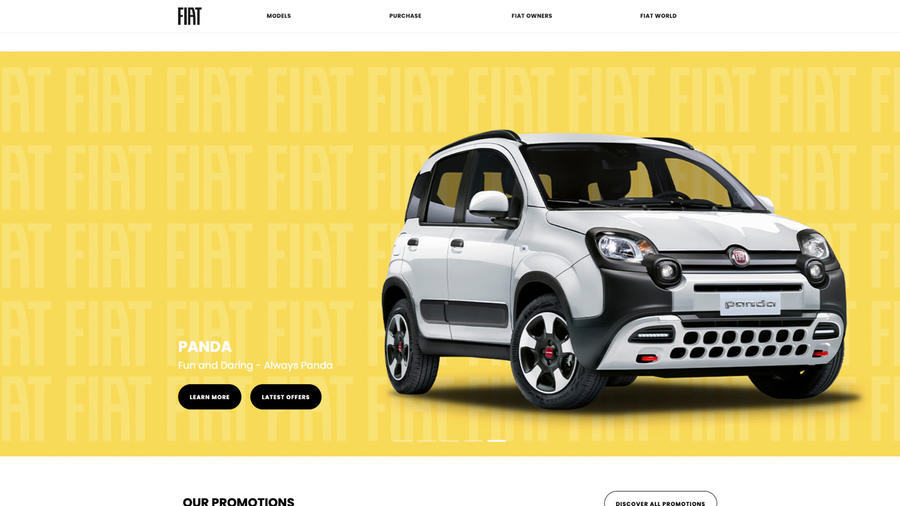
Welcoming, functional and unpretentious, this website is a shopfront for the brand with the stock on prominent display and next steps clearly signposted.
Casual browser 5/5
For some reason, it’s the labels – ‘configure’, ‘discover more’, ‘purchase’ – on the homepage that grab the attention more than the brightly coloured models displayed on two range decks. As invitations to dig deeper, they succeed.
Configurator 2/5
Functional but limited. The best that can be said about it is that there is one. In fairness, the 500 EV has a sound demo and interiors are sharply rendered. A rotation tool and greater versatility would be welcome.
New car buyer 5/5
From model range galleries to feature cars that refresh at intervals, entry points abound. ‘Discover more’ piques the interest and is a click away from the configurator and its links to finance and a test drive.
Used car buyer 4/5
Spoticar markets used Fiats. The site doesn’t feel part of the Fiat family that the main website works so hard to promote, but at least the search filter is good.
Finance 2/5
There are finance explainers but without the financial health warnings we’d like to see. ‘Customise your finance’ has a hire purchase calculator but strangely not one for a PCP. It can show a blank screen, too.
Ford
3.5/5
Date tested: 4.1.23
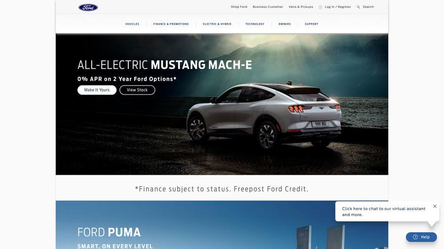
This website gets down to business with impressive functionality including search and filter tools supported by good signposting, but it can tie the user in knots.
Casual browser 5/5
Helpfully, Ford gives its most popular models top-billing on the homepage. As the user scrolls down, the main top menu remains visible to aid navigation, while clear labelling and well-plotted journeys encourage exploration.
Configurator 3/5
Realistic visuals bring Ford’s configurator to life, but why not provide a rotation tool rather than a click-and-drag function that can be hesitant? Apart from changing colours and wheels, there’s not much to do, either.
New car buyer 3/5
Range galleries, copious ‘build & price’ buttons and a stock inventory searchable by price and delivery date are just a few of the tools available to buyers. However, their number and variety can confuse the inexperienced.
Used car buyer 4/5
The used area isn’t easy to find (it’s in the vehicles menu or ask the virtual assistant). Having located it, a search button takes the viewer to a filter and to listings that are impressively on-brand.
Finance 2/5
In the finance section are explainers relating to no less than four products. However, the calculator in the configurator refers to only two, while the absence of a part-ex valuation tool is frustrating.
Genesis
3.5/5
Date tested: 17.1.23
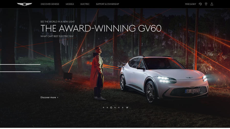
Brand showcase, model guide and buying tool, this Swiss army knife of a website does the lot, impressively, while its dynamic pages, pin-sharp imagery and configurator tool have genuine wow factor.
Casual browser 5/5
The ‘Discover Genesis’ feature is a good invitation to explore, while the way models – superbly lit and photographed – enter pages in the range gallery is fresh and attention grabbing. ‘Discover more’ buttons link to dynamic pages with interchangeable text and imagery.
Configurator 5/5
Among the very best configurators with pin-sharp, 360deg visualisations and zoom in and zoom out controls. Exterior colour changes emerge rather than instantly appear and there’s a good array of customisation possibilities. Classy and immersive.
New car buyer 5/5
‘Find & buy’ cuts to in-stock vehicles, the configurator and subscription. Alternatively, the model gallery includes ‘configure & buy online’ tabs. A simple category tool filters the range by body style. It couldn’t be simpler.
Used car buyer 0/5
Used cars don’t feature.
Finance 3/5
A finance calculator within the configurator works with cash, PCP, personal contract hire and hire purchase. Like other sites, there’s a running cost calculator comparing EV and petrol models but no part-ex valuation tool.
Honda
3.5/5
Date tested: 5.1.23
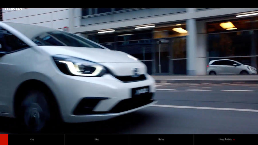
Just like its cars can be, Honda’s website is fun and fresh with innovative treatments and interactive tools that grab the attention and inspire action.
Casual browser 5/5
The Civic virtual showroom on the homepage brings the sales presentation to life with video and swipe functionality. Ditto the range area. Prominent ‘Help me choose’ and dedicated configurator box-outs prompt visitors to explore.
Configurator 3/5
Images are clear but on some models viewable only in a letterbox frame or a box. A full-screen option would be nice. Also, only some have a swipe and rotate function, and interior views distort when you’re using this.
New car buyer 4/5
Star model features, a range display and the virtual showroom funnel the visitor to the detailed but engaging model presentations. If it all gets too much, ‘What’s next’ offers ways forward, including another route to the configurator.
Used car buyer 5/5
As bright and fresh as the new car area. Know what you want? Click on ‘search’. If users are unsure, there’s an assisted search function with filters. Listings are professional and on-brand.
Finance 2/5
Finance guides are provided and there’s a finance calculator in the configurator summary. The trouble is, having found it once, we failed to again… The used car calculator is more visible. There’s a part-ex-valuation tool but users have to register to use it.
Hyundai
3/5
Date tested: 5.1.23
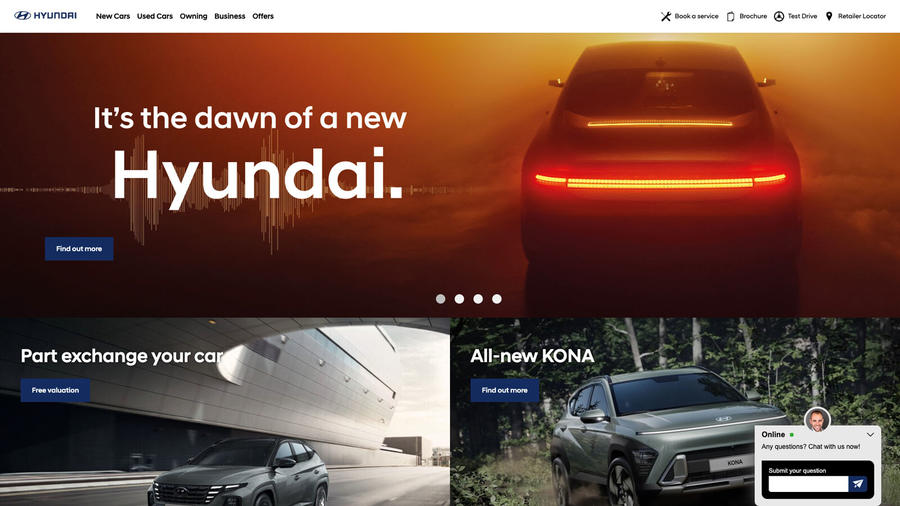
Not the prettiest environment (Hyundai’s blue is a little cold) but clearly structured, very helpful, versatile and with a nice feeling of community.
Casual browser 4/5
There are plenty of homepage start points, but our pick is the virtual experience centre, an interactive showroom tour that introduces the model range and more. The more time-pressed can navigate from the top menu.
Configurator 2/5
Not hugely prominent, a little bit pokey and fiddly, and because the cars are so well equipped, there’s not much to tweak. On the flipside, the summary has a choice of finance calculators and a dealer link.
New car buyer 4/5
Choose by model or by search filter. Users can compare models, too, while the configurator and finance calculators are always close by, if not hugely prominent. Don’t want to own? Check out Hyundai’s subscription offers.
Used car buyer 0/5
Find the used car area from the top menu. There’s a traditional search filter or hunt by model type. The bad news? When we tried it on both desktop and mobile, the site was dead as a dodo.
Finance 4/5
Cash, PCP or HP: Hyundai offers calculators for all three in the configurator summary. Finance presentations are buried in the ‘Offers’ area, from where the visitor can personalise finance on a choice of promoted models.
Jaguar
4/5
Date tested: 5.1.23
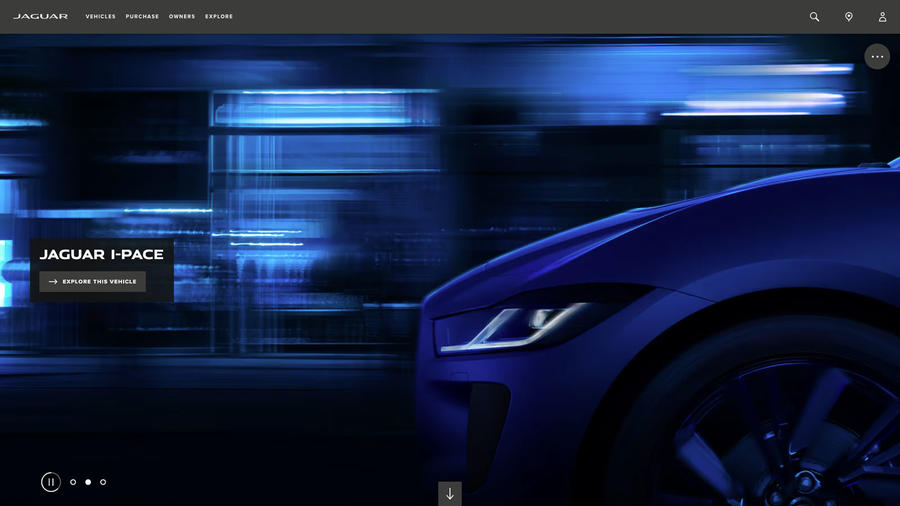
Blue: that’s the first impression. And that’s what this site does best: create a powerful impression and desire in the viewer. Fortunately, there’s substance beneath, too.
Casual browser 5/5
Imagery is bold and beautiful and it’s tempting to dip in and out of models to enjoy the treatments, the SVR section with its Nürburgring Project 8 video especially. Back to business and there’s good signposting, too.
Configurator 4/5
Only still images here sadly, but they’re pin-sharp. Change colours, exterior packs and brake calipers, among many things. Inside, change seats, mats and steering wheel. Work out how to pay for it all with the finance calculator.
New car buyer 5/5
Explore the range, build the car, work out finance and place an order: it’s as simple as that. Meanwhile, there’s a section dedicated to hybrid and electric that goes into the tech in impressive detail.
Used car buyer 5/5
‘Approved used’ isn’t that prominent but it is smartly executed with all listings impressively on-brand. Visitors can edit their finance and best of all, get a part-ex guide valuation without sharing their contact details.
Finance 4/5
PCP, HP and an advanced payment plan with no monthly repayments are all offered and presented in a comprehensive finance section which includes helpful video tutorials on topics including APR and vehicle return conditions.
Jeep
3/5
Date tested: 5.1.23
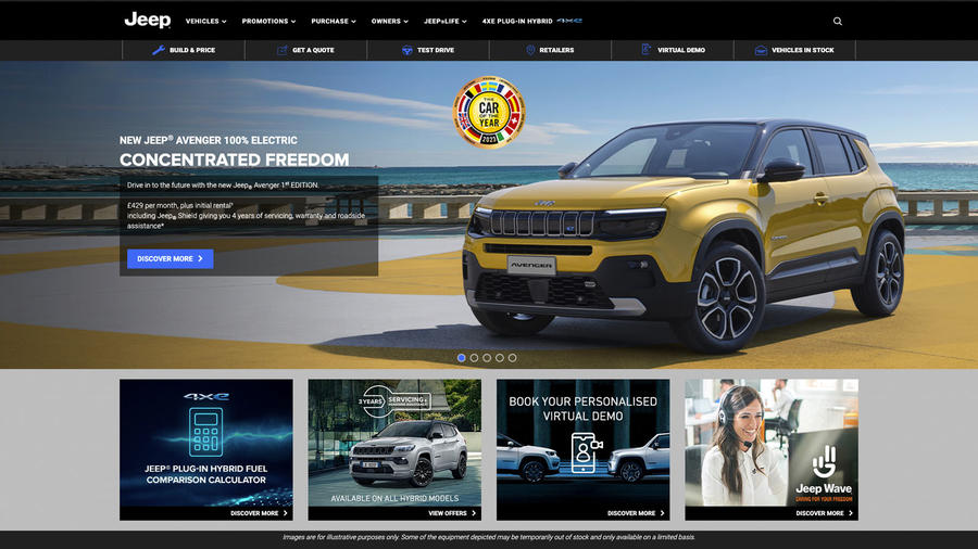
Adventure brand it may be, but Jeep has a website that feels like it would rather stay home. It all works but lacks visual excitement and doesn’t inspire.
Casual browser 3/5
All the homepage content is visible without scrolling but densely presented, albeit well organized with clear labelling. The ‘virtual demo’ sounds promising but requires a dealer rather than being an interactive video tour like Honda’s.
Configurator 3/5
This reskinned version of other Stellantis configurators features an exterior rotation option and a handy 360deg viewing tool for the interior. Resolution is good, there’s a reasonable level of personalisation and there’s a finance calculator.
New car buyer 4/5
What it lacks in adventure, this website makes up for with good signposting and labelling, detailed model presentations and straightforward consumer journeys. There’s a good hybrid tech presentation, too, with a fuel comparison calculator.
Used car buyer 4/5
Used Jeeps are gathered in Stellantis’s Spoticar approved used website. There’s a good search engine and used vehicles are professionally presented, but Spoticar’s branding is dull and the magic of the Jeep brand is lost.
Finance 3/5
Supporting the finance calculators are finance presentation videos explaining the various options: PCP, HP and PCH. Bizarrely, the ‘discover more’ button simply links to the Renegade Hybrid model page.
Kia
3/5
Date tested: 9.1.23
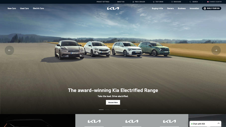
Like its cars, Kia’s website simply works. Everything the visitor requires is here within a couple of clicks and swipes; just don’t expect to be inspired.
Casual browser 4/5
By keeping things simple but functional, Kia has built a website that’s easy to navigate and to explore. With little effort, the browser is quickly exploring the new or used model range and their finance options.
Configurator 2/5
No one would ever use Kia’s configurator for fun. It’s functional and informative but dull. Users can change wheel designs but can’t see the update. Want to explore the interior? Sorry, it’s not visualised. Only the exterior is shown. At least it can be rotated…
New car buyer 4/5
The EV area is well organised and informative. Elsewhere, the general range area is easy to navigate. Model details include offers, which is helpful, or users can go to the configurator, which includes a finance page.
Used car buyer 4/5
Used cars are presented under the approved used banner in their own searchable area. Nothing new there, but it’s the ease with which users can navigate to them that impresses. Listings are professional and on-brand.
Finance 3/5
New car calculators are accessible from a sub-menu in the model range or in the configurator. However, only PCP or HP are offered and there are no explainers providing advice or words of caution.
Lamborghini
3.5/5
Date tested: 9.1.23
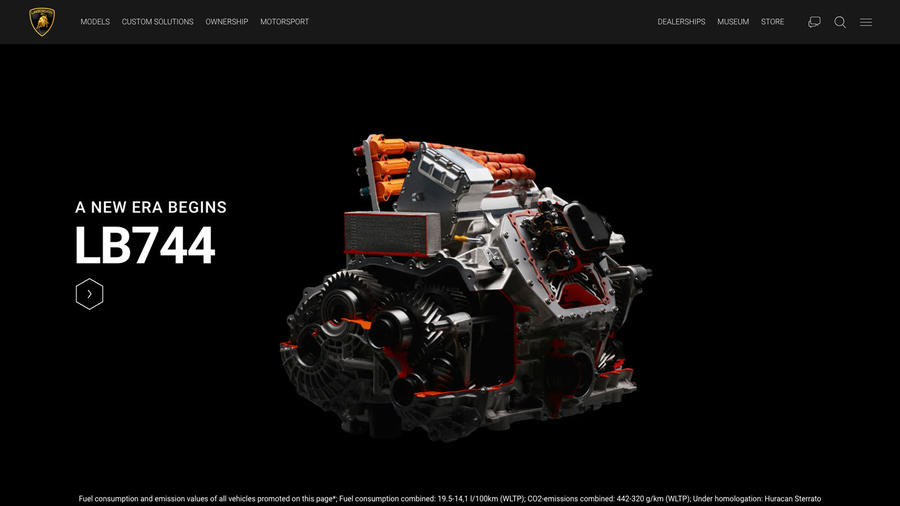
This site brings the Lamborghini brand to life with lots of video, sound samples and punchy text, but there are gremlins including a used car area that doesn’t work.
Casual browser 5/5
There’s bags to discover but the whole thing kicks off with a short film about what an old barber shop that’s about to close down tells us about the people and choices of the past…
Configurator 3/5
Again, there’s lots to do, but it’s a little creaky, while images are disappointingly soft and computer-generated. Users can rotate images in the model range section but not in the configurator. The colour palette is fantastic.
New car buyer 5/5
From the homepage, users can explore the model range or go to the configurator. Model features inform and inspire. The videos are watchable and the exhaust-note samples addictive. No prices are given, but if a visitor has to ask…
Used car buyer 0/5
There’s a used car area, but when we tested it on mobile and desktop, the search function didn’t work.
Finance 1/5
There’s a finance explainer but no calculator.
Land Rover
4/5
Date tested: 9.1.23
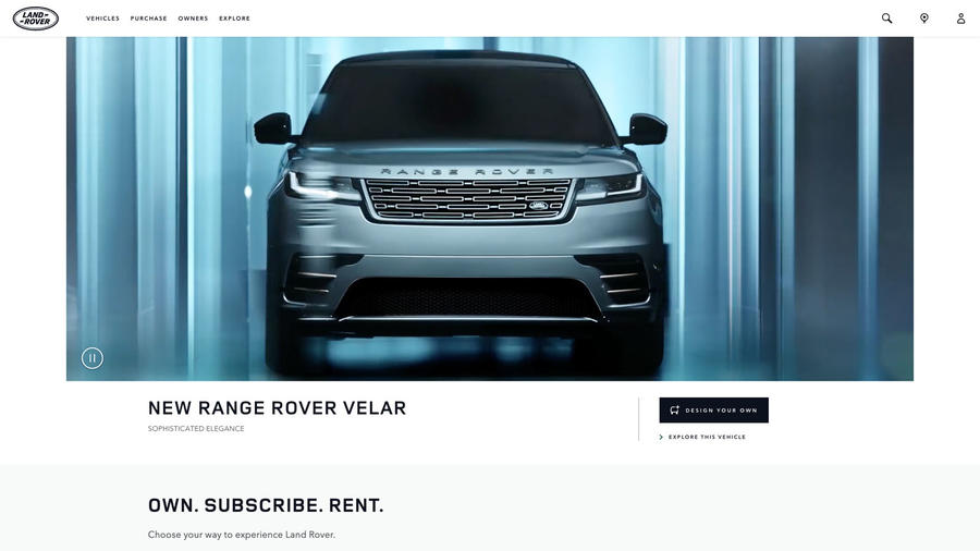
This premium website is classy, restrained and well-organised. It has great photography and plenty of opportunities for exploration, including an intriguing Defender selection tool.
Casual browser 5/5
There’s a bewildering choice of entry points, but most link to absorbing topics, including SVO and classic vehicles. However, it’s easy to get lost or to find yourself on a page you can’t recall having selected.
Configurator 4/5
This is a feature-packed area with the bonus of a rotation tool, although not one in 360deg. Users can personalise most things including headlights and tow hooks and see the tweaks, too. Model-specific backgrounds are welcome.
New car buyer 5/5
Model selection tools plus opportunities to discover the range or drill down to specific model variants abound. All link to the configurator and to finance. In addition, there’s a useful guide to EVs and powertrain options.
Used car buyer 5/5
The used cars button isn’t immediately visible on the homepage (it’s under the ‘Vehicles’ and ‘Purchase’ tabs in the top menu). The search filter is impressive (users can search interior colour) and listings are on-brand.
Finance 5/5
There are finance guides and it’s possible to personalise quotes from the configurator or choose new cars based on a budget. Alternatively, there’s the option to subscribe using Land Rover’s Pivotal product or even rent with unlimited mileage.
Lexus
3.5/5
Date tested: 9.1.23
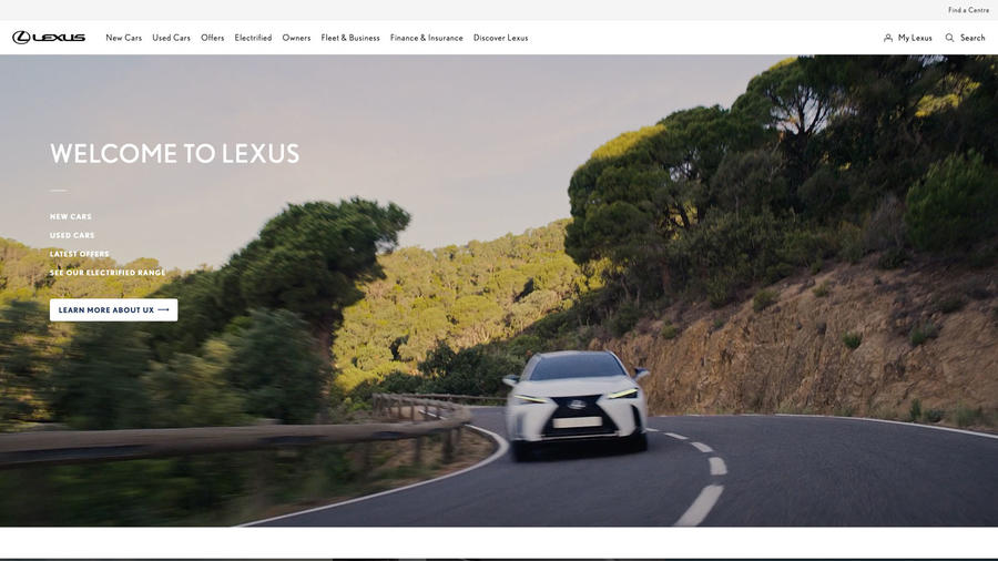
Bright, attractive and easy to navigate, this website also lacks inspiration and engagement. It’s functional, with few innovations for a such a premium brand.
Casual browser 5/5
A two-deck homepage with clear signposting presents everything in one sweep. Click on new cars for a well-organised model gallery or ‘electrified’ for an EV presentation. It’s easy to move forward or retrace steps.
Configurator 3/5
Images are clear and crisp and it’s possible to rotate the exterior view, but interiors are a series of stills without 360deg functionality. Wheel choice is limited but users can play with interior colours and materials.
New car buyer 5/5
From model range to finance is plain sailing. Users can buy online, too. Meanwhile, for visitors who have been living on the moon for the past few years, there’s a large section explaining what an SUV is.
Used car buyer 5/5
Quickly found via the homepage top menu and fully searchable. Listings are nicely on-brand and the visitor can customise their finance quote which, for younger vehicles, is a choice of PCP or HP.
Finance 4/5
Detailed finance guides on personal contract purchase, personal contract hire and hire purchase can be found under the ‘Owner’ tab on the homepage. The finance calculator has a part-ex valuation tool, but its estimates aren’t very competitive.
Lotus
4.5/5
Date tested: 9.1.23
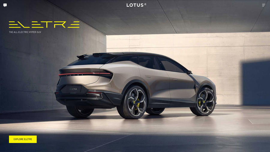
A slick and inspiring website that brings the brand to life in just a few quick clicks and swipes. Visually appealing with some dynamic text and videos.
Casual browser 5/5
The new Eletre SUV takes the homepage top spot, while below you can discover the range via the model names alone, each with their key specs and discover or configure tabs. Elsewhere, sign up for a factory tour or watch a video about the history of Lotus.
Configurator 5/5
Great visuals and lots to personalise. Users can also change environments (urban, country or studio) and, on the Eletre, view animations, as well the car in 360deg. When finished, they can view a video of their personalised car.
New car buyer 5/5
The Explore tab in the models section features exterior and interior images with clickable points of interest, which is engaging. There are video features, too, in place of text. Click ‘configure’ to personalise the car.
Used car buyer 5/5
There’s a dedicated and properly branded area for uses Lotuses. Users can search by six main criteria ranging from model to location. Listings are detailed, comprehensive and professional but there’s no finance calculator.
Finance 4/5
Videos explain the various finance options and there’s a finance calculator and part-exchange valuation tool that gives quotes without the user having to share personal information, thereby avoiding the inevitable dealer follow-up.
Maserati
3/5
Date tested: 10.1.23
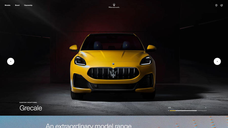
A dynamic, involving and multifaceted website that quickly immerses the viewer in the world of Maserati, feeding dreams of ownership. Job done.
Casual browser 5/5
Dynamic pages can be distracting, but when the content and photography is this good, it’s fine. From video features and stories of Maserati’s history, users can explore the model range or configure their MC20 Cielo supercar.
Configurator 3/5
Surprisingly, for a premium marque, exterior images can’t be rotated and there’s no 360deg visualisation tool for interiors. It probably explains why images are, however, pin-sharp and paint, lustrous. Users can personalise everything from trims to hi-fi.
New car buyer 5/5
In contrast to the configurator, model feature pages have an array of viewing tools plus videos and compelling text. They’re all about creating desire, encouraged in the configurator and satisfied in the shopping tools sub-menu.
Used car buyer 3/5
Not the easiest to find (used cars are listed in the ‘Ownership’ menu), but listings are on-brand. However, lead images are often low-resolution and the listings themselves look curiously empty, an impression accentuated by undersized text.
Finance 1/5
Having whet the viewer’s appetite for a new Maserati, the brand’s finance treatment is disappointing. All further enquiries must be conducted with a dealer, while the offers page has precisely zero offers.
Mazda
3/5
Date tested: 10.1.23
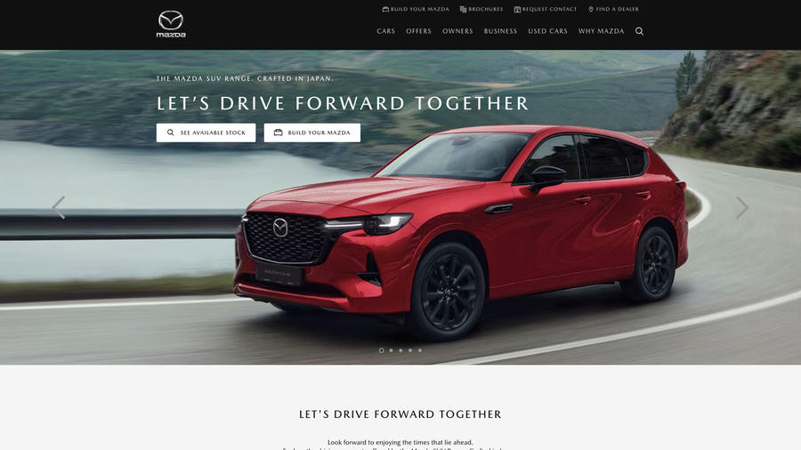
A smart and attractive website packed with information, great functionality and with loads to discover, but behind that pretty face, it means business.
Casual browser 5/5
Plenty to explore from the homepage including an expansive range gallery, model configurator and approved used cars or simply start from the two top menus, which feature an intriguing ‘Why Mazda’ tab. We clicked on it…
Configurator 3/5
Good, sharp exterior visuals you can rotate and a 360deg interior visualisation tool are welcome features here. However, personalisation options are limited and some, including exterior accessories, don’t show on the configuration.
New car buyer 5/5 It may looks classy, but this website is all about shifting the metal with multiple calls to action. A ‘showroom’ for each model does the hard sell while the configurator deftly links to next steps.
Used car buyer 3/5
These are located some way down the homepage but are well presented and eminently searchable. There’s a finance calculator (HP and PCP) and a part-ex valuation tool, although the user has to share contact information, which is offputting.
Finance 1/5
The finance calculator is rarely more than a click away and is visible throughout the configuration process. Contract hire as well as PCP and hire purchase are available, but the finance presentations say nothing about responsible borrowing.
McLaren
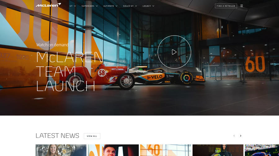
4/5
Date tested: 10.1.23
A premium website that communicates the McLaren brand and its products powerfully and persuasively and which gives a sense of community.
Casual browser 5/5
Lots to explore from heritage, through racing to the model line-up, and that’s before the user starts playing with exhaust simulators or the configurator, found via the tabs in the model drop-downs. The ‘Full force of McLaren’ gallery is compelling.
Configurator 4/5
Masses of personalisation opportunities from engine cover material to seatbelt colour. Exterior views rotate and animate, interiors have 360deg visualisation. Images are sharp, but the interior visual is too large and tricky to manipulate.
New car buyer 5/5
Model range and featured car are conveniently located at the top of the homepage. Users need to know their supercars from their ultimates, but having worked that out, discover and configure tabs quickly take them to the action. Used car buyer 5/5 Suitably on-brand with key data clearly visible before the user clicks on ‘vehicle details’. Listing photography uniformly excellent and all cars in lead images identically angled for a consistent look that Ron Dennis would appreciate.
Finance 0/5
There’s no mention of finance.
Mercedes-Benz
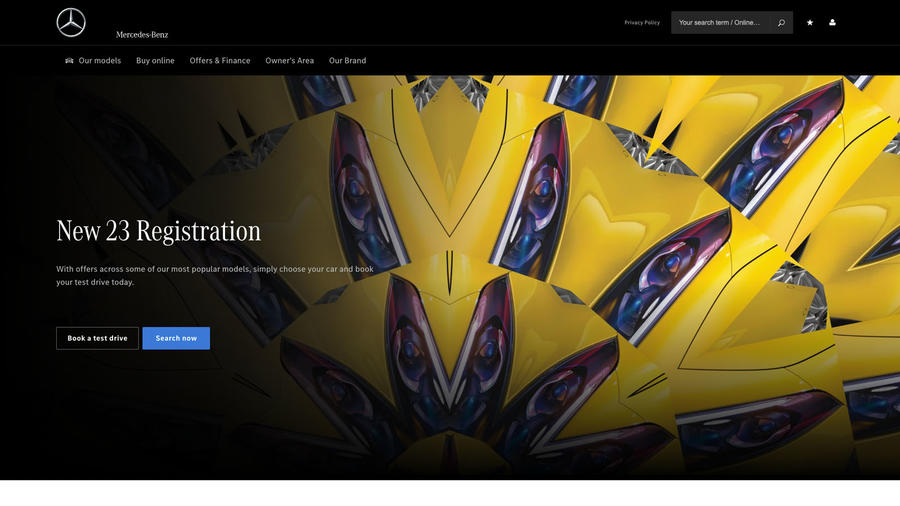
4/5
Date tested: 11.1.23
A shopping tool like no other, the Mercedes website presents multiple ways to browse, choose and buy a new or used car. It’s slick and sophisticated.
Casual browser 5/5
Users are unlikely to take the same journey twice, there are that many routes to follow. Not everything is obvious, which doesn’t help. For those not sure what they’re looking for, there are model search filters galore.
Configurator 4/5
This is a slick system with sharp images plus exterior rotation and 360deg interior visuals. However, there isn’t much that can be tweaked. For example, wouldn’t it be nice to change the brake-caliper colours on your AMG?
New car buyer 5/5
Impresses with features including model videos, exterior rotation tools for visualising colours and multiple vehicle selectors. On top of these, there’s a buy online button (although the page doesn’t always open) and offers (for example, a £2500 discount on an A180).
Used car buyer 5/5
Opens with a more interactive search filter than most. Listings are impressively on-brand and there’s an interesting ‘previous usage’ detail outlining past ownership, such as ‘was a press car’…
Finance 1/5
Finance guides have no advice on responsible borrowing but do include one itemising vehicle return charges to the last dent. It’s not possible to personalise new car finance, but there’s a finance-eligibility checker in the online shop.
MG

3.5/5
Date tested: 10.1.23
Unpretentious and functional but attractive, MG’s plain-speaking website is a breath of fresh air. No wonder the Chinese brand is on a roll.
Casual browser 5/5
On the homepage, two menus fight for attention, but that’s fine, since they each have topics worth exploring. Good signposting, clear labelling and punchy headlines that quickly communicate key selling points, keep the user scrolling.
Configurator 1/5
In fact, this is the only thing MG could be accused of overegging, since all that can be changed is the car’s colour and the only view available is the exterior, pictured from the front.
New car buyer 3/5
A bright and compelling range gallery funnels the viewer to concise model summaries complete with video presentations, test drive requests, finance and a local stock search. The only thing missing is a more versatile configurator.
Used car buyer 3/5
This area has a simple search filter leading to clearly listed used cars. What spoils things is the inconsistent photography, some studio-based, others taken on the forecourt. A finance calculator would be helpful, too.
Finance 5/5
There’s an easy-to-use finance calculator a click away and top marks to MG for including affordability advice in its finance pages, one of the few car makers to do so. Helpfully, there’s a part-exchange calculator, too.
Mini
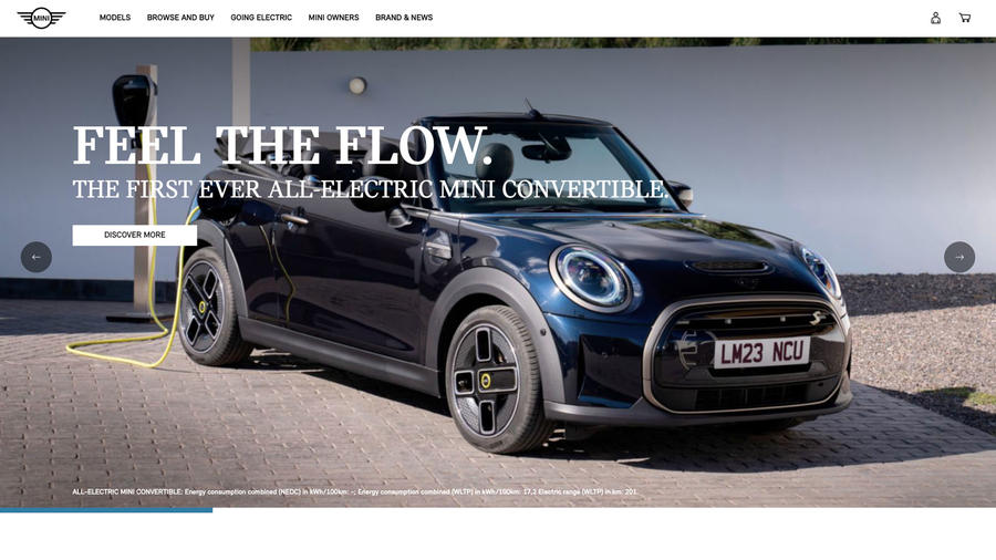
4.5/5
Date tested: 10.1.23
Youthful (although there is a story about ‘silver sliders’) and vibrant, the Mini website sells the brand hard, but it’s helpful and easy to get drawn into.
Casual browser 5/5
Where to start? The feature gallery on the homepage, the range gallery below or explore approved used? It’s all to play for and if users need a hand, there’s a ‘Browse and Buy’ section.
Configurator 5/5
Pin-sharp and attractive visuals are the big takeaway from this. They’re unusual in a configurator. Users can rotate images while interiors benefit from a 360deg tool. There’s lots to do, but it’s easy to navigate.
New car buyer 5/5
A sub-menu helps make sense of the various destinations within the model descriptors while, if users are undecided between versions, there’s a handy comparison tool. The EV area is excellent. Track in-stock Minis using the locator.
Used car buyer 5/5
Find these in ‘Browse and Buy’ or halfway down the homepage. The search filter requires a little practice but once mastered is effective. Listings are on-brand, informative and temptingly presented, with 360deg interior viewing possible.
Finance 3/5
There are finance video guides (smoothly voiced but offering few words of warning) but no finance calculator except for used cars (APRs are high). For new ones, users must speak to the finance rep at a dealership.
Nissan
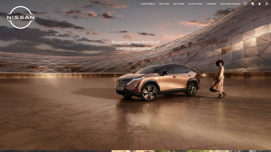
4/5
Date tested: 11.1.23
A clear and intuitive website that mixes effective labelling and signposting with innovative and helpful features that make choosing and buying a car child’s play.
Casual browser 5/5
There’s plenty to explore including the ‘find your ideal car’ tool and, if users are serious, the live showroom and its guided tour of a chosen model. Given Nissan’s EV heritage, the electric section is, unsurprisingly, comprehensive.
Configurator 4/5
Images are sharply rendered, colours natural and materials finely detailed. Exterior images can be rotated and interiors viewed in 360deg, although the addition of things such as a sunroof aren’t shown and, frustratingly, some tasty options cancel out others.
New car buyer 5/5
Selection filters, guided vehicle tours and an online shop: just a few ways visitors can choose and purchase a new Nissan. Model pages have clear quote request, check stock and configure tabs, plus links to special offers.
Used car buyer 5/5
This area isn’t obvious (it’s in the homepage menu) but is impressively on-brand and well constructed, with cars searchable by filter or model range gallery, while stock availability is clearly shown. Listings and images are smart and professional.
Finance 3/5
PCP and HP are covered in detail but with few words on responsible borrowing. However, the configurator offers only a PCP finance calculator, presumably because fewer buyers take HP. Used car listings have no finance calculator.
Peugeot
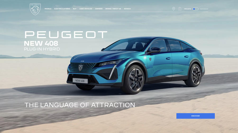
2.5/5
Date tested: 12.1.23
An ambitious but fussy and complex website while some functions, such as the configurator and destinations such as new car offers have broken links.
Casual browser 2
Frustrating at times with some buttons, such as ‘build & price’, ‘buy online’ and ‘offers’ tabs linking to blank pages or a part-complete, offers title page. The compare button simply took testers back to the model gallery.
Configurator 2/5
Build and price tabs in model pages and the configurator link in the top menu linked to a blank page. We found it using the ‘Create your new 408’ tab and ‘latest offers’ in the top menu, but it has limited functionality.
New car buyer 3/5
Broken links discourage the new car buyer exploring further. At least the link to the virtual showroom worked. Model pages are too wordy and would benefit from features such as videos and rotation tools.
Used car buyer 4/5
The used vehicles tab links to Spoticar. It looks drab but the listings themselves are professional and most images of a satisfactory quality. There are PCP and HP calculators.
Finance 3/5
Peugeot offers not one but three PCP products, with PCP Plus aimed at young drivers and PCP Just Add Fuel at those wanting most running costs bundled into one payment. All three are explained in a dedicated section.
Polestar
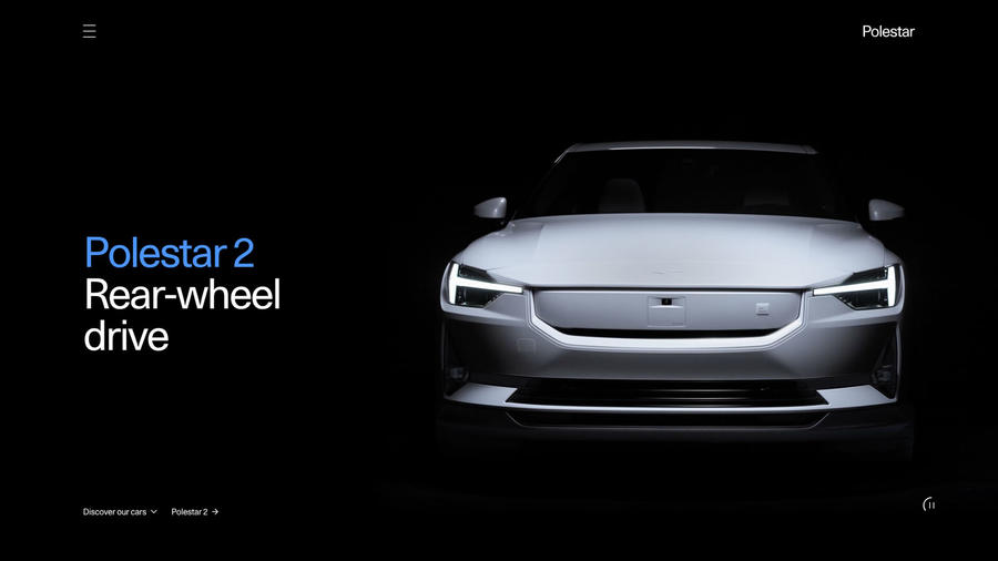
4.5/5
Date tested: 12.1.23
A cool and contemporary-looking website that communicates the Polestar brand’s values clearly and persuasively and which presents its new and used cars intelligently and enticingly.
Casual browser 5/5
There’s much to discover here, from video features on topics including design and sustainability to news and forthcoming models. Many pages are dynamic, with zoom and swipe functionality, and images are pin-sharp and superbly lit.
Configurator 4/5
In place of the rotation and 360deg image tools that other sites use, Polestar simply uses crisply rendered stills. Personalisation choices are limited to the essentials. When complete, users can view similar cars in stock or about to be.
New car buyer 5/5
From the ‘How to buy’ section or the range gallery, users can enjoy interactive model features and concise but compelling text. It’s not a hard sell. Instead, the means to configure, order and buy are there but discreetly.
Used car buyer 5/5
Cleverly, searches are based on the model selected on the main homepage. The presentation is indistinguishable from the new car section in terms of image quality and the search filter uses imagery. The section gives used cars a new-car feel.
Finance 3/5
A finance section explains the three main products – personal lease, PCP and HP. There’s an informative Q&A and finance calculators in the configurator summary but only a PCP calculator for used cars.
Porsche
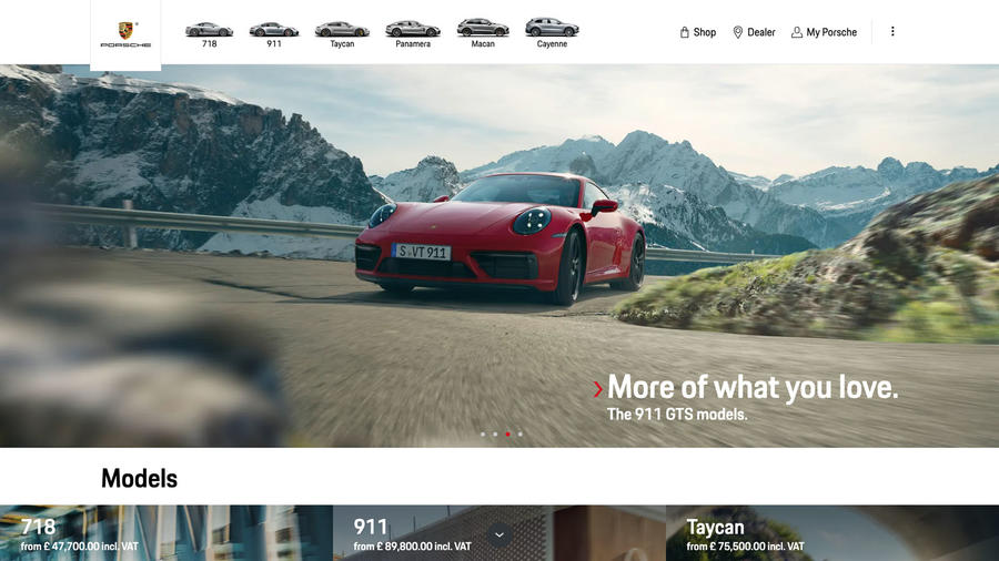
4.5/5
Date tested: 12.1.23
Not the testosterone-fuelled experience the user might expect but a sober and grounded website largely free of hyperbole but packed with content and immersive touches.
Casual browser 5/5
Feature models and the range gallery dominate the homepage or users can cut to the action via the model selector and, via the 911 sub menu, the Sport Classic configurator. Model pages include videos, image rotation and 360deg visuals.
Configurator 5/5
There are no rotation or 360deg tools but instead crisp images with the ability to change backgrounds or view changes in augmented reality. A recommendation score helps keep tweaks sensible, which is wise, given their number.
New car buyer 5/5
Unlike some premium brands, Porsche isn’t coy about revealing prices, which builds buyer confidence. The homepage offers multiple start points including the ‘shopping tools’ zone with a comparison tool that can accommodate three models.
Used car buyer 5/5
This is easy to navigate to and listings are on-brand, while the section has the look and feel of the rest of the site. The search filter includes the car’s number of previous owners, which is rare but helpful.
Finance 3/5
To the customary PC and HP products, Porsche adds lease purchase, a kind of hybrid PCP scheme whose deposit can be as low as one month’s repayment. Only used cars have a finance calculator.
Renault
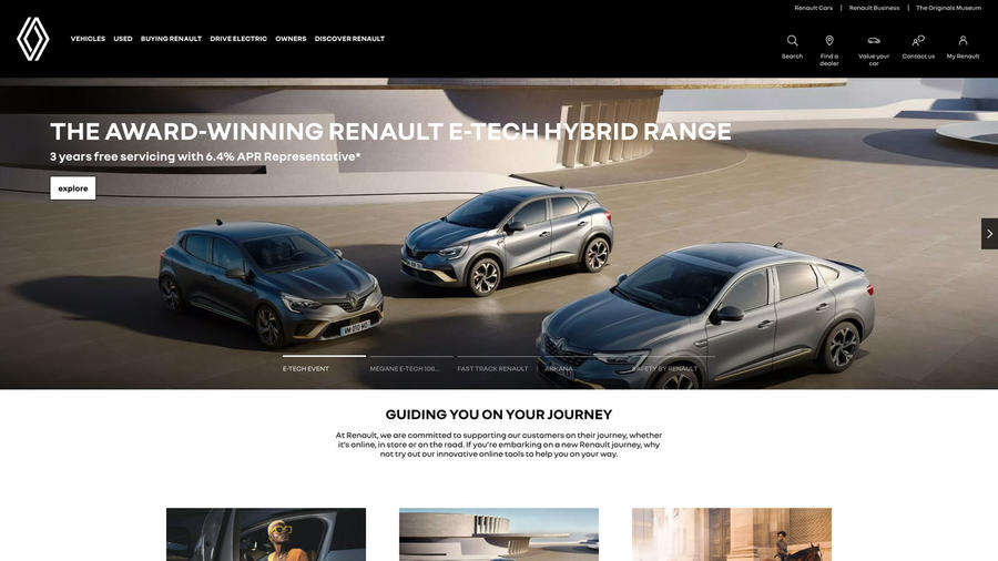
3/5
Date tested: 12.1.23
On first sight a functional, serious and text-heavy website but which, on closer inspection has useful tools and a welcoming tone that encourages the curious.
Casual browser 4
‘How can we help you?’, ‘What’s in stock today?’ and ‘Which Renault takes your fancy?’, all on the homepage, are compelling invitations to explore. Check out the 50th anniversary tribute to the Renault 5 or the EV section, too.
Configurator 2/5
Limited personalisation is this configurator’s problem (most models have just one choice of alloy wheel and interior design). Visualisations are soft and artificial, too, but exteriors can be rotated and interiors viewed in 360deg.
New car buyer 4/5
Those questions mentioned earlier (casual browser) start the user on their journey. Alternatively, there’s the range gallery on the homepage or as a drop-down. ‘View offers’ and test drive tabs abound but there’s little passion for the cars.
Used car buyer 4/5
The used cars drop-down on the homepage links to a branded area with a search filter and the option to buy online. Listings look professional and the ‘enquire now’ tab links to a part-ex valuation tool.
Finance 3/5
Finance, whether in the form of offers or a calculator, is a prominent feature throughout. However, the guides give no advice on responsible borrowing. The Mégane E-Tech Electric is unique in being available on subscription or PCH.
Rolls-Royce
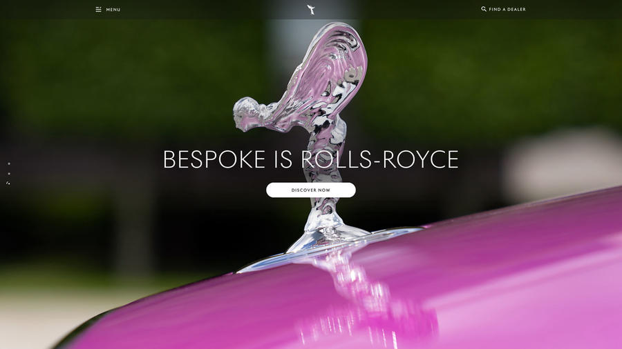
4/5
Date tested: 13.1.23
More than just a website, this is an experience. With so much to see and do, it’s something to be savoured rather than rushed.
Casual browser 5/5
This website constantly serves up surprises and added value in the form of videos and copious features. However, moving from it to the computer’s desktop is a clumsy experience, owing to the change in cursors.
Configurator 4/5
Almost infinite personalisation options (different-coloured umbrella handle, anyone?) compensate for disappointingly soft images and the absence of 360deg interior visualisations. We also experienced occasional loading issues.
New car buyer 4/5
A Rolls isn’t purchased, it’s commissioned, advises the website. In addition, the configured design is only a vision that should be discussed with a dealer. Given the exclusive nature of a Rolls and its high price, conventional purchase tools are absent.
Used car buyer 5/5
Found under ‘Provenance’, the curated selection of pre-owned Rolls-Royces (the company’s terms, not ours) is first filtered by model and trim. Listings are on-brand, although lead images are inconsistent. Up to three models can be compared.
Finance 0/5
Finance isn’t mentioned on the website.
Seat
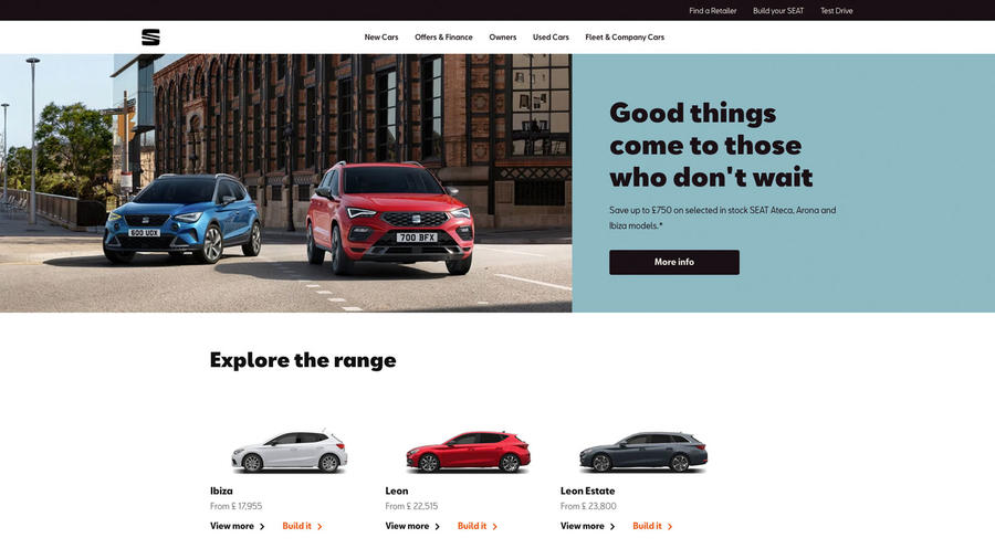
3.5/5
Date tested: 13.1.23
Seat knows money talks, and this website isn’t shy about discussing the subject. Fortunately, it has personality, too – loads of it. It’s a ray of Spanish sunshine.
Casual browser 4
The feature gallery, the range review or the discovery section: just three places visitors can begin their journey. Clear labelling and signposting keeps them on track. Annoyingly, though, some topics in the top menu failed to drop down when we tried them.
Configurator 4/5
Easy to find and as simple as they come. Paint choices carry no price premium, which makes things simpler still, but wheel and interior choices are extremely limited. Images have rotate and 360deg functionality.
New car buyer 5/5
It’s straight down to business, with a prominent model range on the homepage featuring clear pricing. It links to the configurator, whose summary in turn links to offers, which can be personalised. Smooth and seamless. Used car buyer 4/5
Well signposted but with a search filter that’s not the simplest. To see models, click ‘Show models’ and then ‘Add models’… Listings are in a branded environment and lead images all front-three-quarter, facing right.
Finance 3/5
When it does actually drop down, ‘Offers & Finance’ on the homepage is the place for guides, new and used car offers and the calculator, which only works with new cars. Guides are detailed but give no borrowing advice.
Skoda
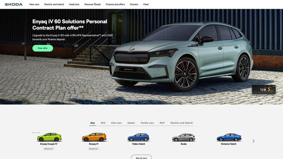
3.5/5
Date tested: 13.1.23
A confident and perception-altering introduction for newcomers, but for seasoned Skoda people simply confirmation they’re right to stick with a brand that never stops evolving.
Casual browser 4
All the usual range galleries and model features are here, but the Skoda Skills videos and virtual showroom get our vote as launch points. Other destinations are well signposted but can be hard to escape from without quitting altogether.
Configurator 3/5
Renderings are sharp but a rotation tool, as used in the virtual showroom, would be welcome. Personalisation opportunities are few but in true Skoda fashion, the configurator page is clearly structured and easy to read.
New car buyer 5/5
‘Take it for a spin’ is Skoda’s test-drive request button. We like it, since it sums up the website’s approach to choosing, configuring and buying a Skoda, a process that’s welcoming, well signposted and well connected. Used car buyer 5/5
Model introductions for people new to the manufacturer and a totally on-brand listings environment show that Skoda takes used cars seriously. So do its dealers, if the pin-sharp images of well-presented cars are anything to go by.
Finance 3/5
The site has more comprehensive finance guides than most, including one on 0% APR, but visitors will look in vain for advice on responsible borrowing. MG alone still shows the way here.
Smart
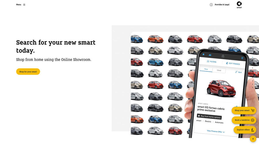
3.5/5
Date tested: 13.1.23
Smart by name but not by nature, this website may feature only two models, plus a third coming, but buying them is a challenge.
Casual browser 4
There’s not much more to do than discover or build your Smart, but it helps that the product and environment are attractive. That said, it’s a surprise to at times be directed to the Mercedes website.
Configurator 3/5
The highlight here is the film of the configured car. It’s little more than a few rotating visuals, some zoomy interior animations and spinning wheels giving the illusion of driving, but it’s fun and unique.
New car buyer 0/5
With the online Smart showroom being the most prominent feature on the homepage, there’s no guessing what this website is about. However, it’s not obvious how to order a configured car, while the ‘Shop your Smart’ pop-up was blocked in our test.
Used car buyer 5/5
Once again, clicking on approved used Smarts takes the visitor to Mercedes’ website. It’s a culture shock, but at least the cars are well presented and their comparatively low prices a pleasant surprise.
Finance 3/5
No fewer than four finance products – PCP, HP, lease purchase and contract hire – are available. It’s possible to personalise quotations for all four on new Smarts and the first three on used ones.
Ssangyong
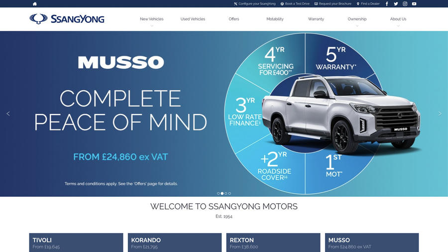
3/5
Date tested: 16.1.23
Less is more with this website. Devoid of visual tricks and clever tools, it speaks simply and directly to the visitor while remarkably exciting curiosity and even desire…
Casual browser 3
Although likely to be a rare animal, the casual visitor is pounced on by powerful reasons to buy, then funnelled to the vehicle guides with their clear submenus as the prelude to a bit of light configuring.
Configurator 2/5
There’s not much to do here other than choose a few exterior and interior colours plus wheel designs, while options are mostly towing based. There are no fancy viewing tools, which someone considering a £45,000 Rexton might miss.
New car buyer 4/5
Ssangyong’s simple approach pays off, because within a trice the visitor is at the configurator summary playing with the finance calculator and then, once satisfied, locating their nearest dealer and completing an enquiry form. Used car buyer 4/5
Used cars are prominently signposted in the main menu but filtered only by model and location, although it’s possible to sort the display by price. Listings are on-brand and look professional and there are dealer contact links.
Finance 2/5
Not the website’s finest hour. There’s a new-car finance calculator and even a part-ex valuation form, but there’s only the briefest of guides to HP and PCP and no borrowing advice.
Subaru
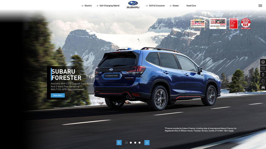
2.5/5
Date tested: 16.1.23
This premium-looking website is glossy and aspirational but risks short-changing the user with its basic configurator, absence of finance calculators and brochure-like presentation.
Casual browser 2
Alluring photography sets the imagination working but pages are over-complicated and two-dimensional with little added value. A useful touch is the Subaru logo in the top menu which takes the user to the homepage.
Configurator 2/5
Bizarrely, Subaru offers two configurators, one approached from the internet search page and which offers a selection of exterior views of the vehicle and the other, approached via the ‘build & price’ dropdown. Neither is especially advanced or versatile.
New car buyer 3/5
Because the range is searchable by vehicle type, the same model can appear more than once, which is confusing. The ‘discover’ tab reveals each model’s details with a clear submenu featuring next steps, which is clear enough. Used car buyer 3/5
This is easy to navigate to from the homepage and searchable by model type then model. Cars are listed in a branded area, but lead images are inconsistent in terms of backgrounds and angles, which doesn’t look great.
Finance 2/5
There’s a finance section that helpfully includes a fulsome guide to condition standards for the return of a car on a PCP. However, there’s no new or used car finance calculator; visitors must liaise with a dealer for that.
Suzuki
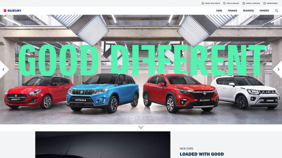
3/5
Date tested: 16.1.23
This is a fresh, warm and welcoming website. The brand’s ‘good different’ marketing campaign sums it up nicely. It could use a few more features to make it shine, though.
Casual browser 5/5
The ‘good different’ page in the rotating homepage gallery encourages the visitor to explore the claim further, which they can via the new cars link below. ‘Help yourself to a hybrid’ is another.
Configurator 3/5
Exterior views can be rotated but the interior is a single image of the front cabin. There’s a good choice of exterior options, but selected ones aren’t itemised in the price summary and some text is confusing.
New car buyer 4/5
There’s plenty to interest the new car buyer here from the hybrid guide, the test-drive invitations and Instagram features to the model pages. The latter are particularly clear, concise and easy to navigate.
Used car buyer 5/5
The well-signposted landing page is simple and functional but attractive. Listings are on-brand and lead images consistently angled. The filter is clear and easy to use, too, while individual listings include a Google map of Suzuki dealers.
Finance 3/5
There are plenty of finance calculators throughout the site and comprehensive and detailed guides, too. They feature some useful advice but only need the addition of more on responsible borrowing to be great
Tesla
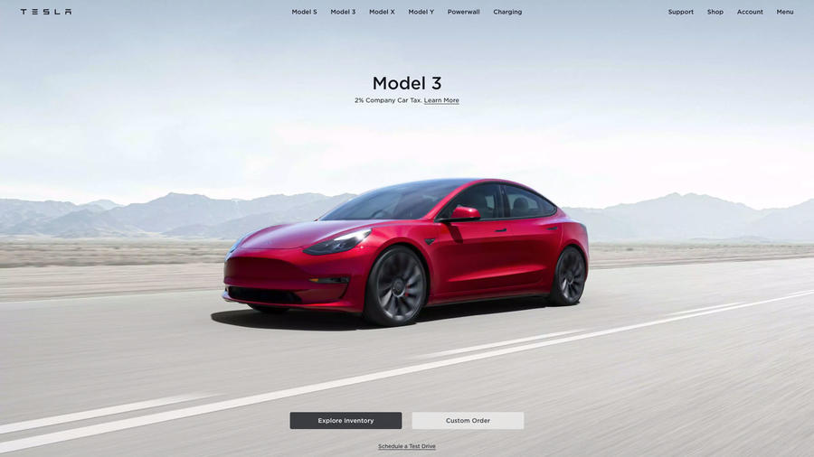
3/5
Date tested: 16.1.23
A cool and modern website that uses the medium to bring pages alive with great visuals, neat features and compelling labelling, but it lacks warmth and can feel intimidating.
Casual browser 5
How content on model pages floats into view is impressive and compelling. White space and clear copy make skimming them easy, too, while call-to-action boxes signal next steps. Lost your way? The Tesla logo links back to the homepage.
Configurator 2/5
Users can have any colour they like, as long as it’s one of only five… In addition, there are just four exterior images and one interior image of each car. There are also just two wheel choices, although a few tech options.
New car buyer 4/5
A prominent model range feature makes light work of navigating to a chosen vehicle, and once you’re there, large and clear images, videos, concise text and key data keep you engaged. Call-to-action boxes quickly communicate next steps.
Used car buyer 4/5
‘Explore inventory’ is Tesla’s route to used cars. There’s a comprehensive search filter that extends to wheel sizes, fitted options and autopilot systems, but it’s not clear whether the featured cars are library images or the real things.
Finance 3/5
New cars include a finance calculator for PCP, PCH and a Tesla loan for up to 72 months. It’s located prominently on the new model pages. There’s a finance section with guides on the various products.
Toyota
3/5
Date tested: 16.1.23
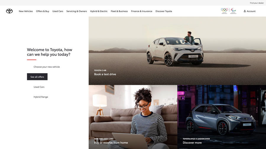
This is a warm and welcoming website with inventive touches to make choosing and buying easier but which fails to convey quickly enough the brand’s appeal and USPs.
Casual browser 5/5
At least viewed on a desktop computer, everything is visible on the homepage without scrolling, which is unusual but welcome. Immediately you can see your options, which are many and varied. Naturally, hybrids are prominent.
Configurator 2/5
Frustrating inconsistencies include 360deg visualisations of interiors on only some models and an absence of clear configuration links on others. Exterior visuals can be rotated, but many derivatives, including the GR Supra, have just one wheel style.
New car buyer 4/5
This site’s ace card with a clear and informative range gallery, plentiful test drive links and a prominent buy online area. Offers, too, are prominent and neatly link to model features and, at least on some, the configurator.
Used car buyer 4/5
The search filter looks untidy but works well enough. Listings are on-brand but year of registration should be more prominent. There’s a finance calculator and, unusually, a ‘negotiate’ button allowing the visitor to make an offer.
Finance 3/5
There are helpful finance guides on PCP, PCH and HP, with prominent links to finance calculators. Again, however, MG remains the only website confident enough to offer affordability advice.
Vauxhall
3/5
Date tested: 17.1.23
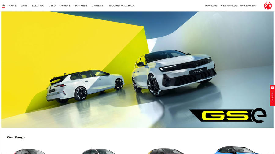
A buzzy, welcoming website with stacks of content (some of it buried, unfortunately) that reflects the new life recently injected into the Vauxhall brand.
Casual browser 5/5
The great new model colours are arresting, as is Vauxhall’s coverage of electric cars. An ‘activity’ gallery in the centre of the homepage satisfies the curious, as does the ‘discover Vauxhall pure technology’ feature.
Configurator 3/5
A clear design and easy to use with rotating exterior visualisations, at least on some models, but only slightly indistinct image stills for interiors (the Corsa is especially disappointing). The number of personalisation options is generous and they’re well chosen.
New car buyer 5/5
Clear range and model/fuel selection galleries supported by detailed video guides shepherd the visitor, who is then just a click away from the configurator, finance calculator or test-drive enquiry link – or buying online.
Used car buyer 3/5
The positive impression created by the main website is undone by the Spoticar-branded used-car area. The pale-blue colourways and small text robs the section of impact and appeal and has a very ‘used car’ feel.
Finance 2/5
Finance guides reside in an area called the Help Centre, a useful destination that unfortunately is buried from view. Borrowers are reminded to check affordability and to factor in running costs, which is a step in the right direction.
Volkswagen
3/5
Date tested: 17.1.23
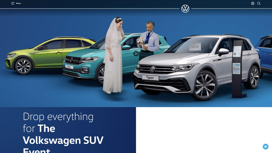
Much like its cars, VW’s website is restrained but well constructed, with useful features designed to make navigating the company’s wide model range as straightforward as possible.
Casual browser 5/5
‘Where would you like to start?’ is a welcome human touch on the homepage, or discover featured models below. An emphasis on in-stock vehicles is a shrewd ploy that reflects current concerns and invites enquiry.
Configurator 4/5
An unpretentious system with good functionality and reasonably clear visualisations. It offers a good level of personalisation, too. The summary page is clearly set-out with additions itemised and priced, and it’s possible to customise finance.
New car buyer 5/5
Range galleries, invitations to discover more and repeated advice to consider buying from stock in view of extended delivery times hold the visitor’s attention as they’re funnelled through model comparison tools to the configurator and dealer contact form.
Used car buyer 2/5
Thoroughly on-brand but cursed by a search filter that’s beyond confusing. All the usual fields are present, but selecting a model derivative to search, and sorting available vehicles by price as well as distance, is difficult.
Finance 2/5
Finance calculators are easy to find and to use. There are guides to the various products, which include PCP and Lease & Care, but they’re short and so not very detailed. For users with a trade-in, there’s a part-ex valuation tool.
Volvo
3/5
Date tested: 17.1.23
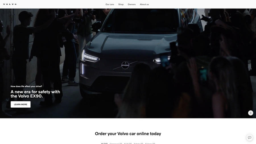
This website reflects the brand with its spare design, high-quality imagery, intelligent tone and simple but intuitive functions. Cool but verging on chilly.
Casual browser 5/5
The site’s spare design is an invitation to explore, if only to understand it. For example, the range gallery function isn’t immediately obvious but it’s smart once cracked. Use of photography and 360deg visualisations is compelling
Configurator 4/5
No fancy visualisation tools, instead pin-sharp images that clearly convey any changes. In addition to the usual exterior colour and wheel changes, there’s a good level of interior customisation. The summary is clear but financing options less so.
New car buyer 5/5
There’s plenty to satisfy the visitor’s urge to acquire a Volvo, from online purchase to subscription. However, an understandable emphasis on electric cars at the start might lead some to think Volvo is already an EV-only brand.
Used car buyer 4/5
The straightforward search mechanic leads to branded listings. Key data is easy to absorb at a glance and vehicle imagery is of a consistently high quality, while a part-ex valuation is generated without having to share contact information.
Finance 2/5
Located at the foot of the homepage, Volvo’s finance section guides the user through their options, which include personal lease and subscription. ‘Current offers’ links to a new stock availability area, but for once the information isn’t clear.
Source: Autocar
